Skip to content

“Polario should be changeable, understandable, open, timeless and robust.”– Ronja Leine, Design Lead plazz AG
In the second part of our mini-blog series, we look at Polario’s design. For this, we asked Design Lead Ronja Leine a few questions. She gives us an insight into the approach and conception of the design.
Imterview – Design System
Hi Ronja, please introduce yourself and the design team.
Our design team currently consists of four employees. We have our Senior Designer Stefan Heinz(in the team since 2011), who took over the position of Chief Product Officerlast year, but is still responsible for the design of Polario’s content management system. We continue with Miriam Aissaoui, who started at plazz AG as a designer in 2017 and is thus already a long-time employee. She is responsible for the design of the Android application at Polario. A new addition at the beginning of 2020 is Franziska Ewe, who jumped right into the project and took over the design of our web app. And last but not least there is me, Ronja Leine, team member since 2015. At Polario, I am responsible for the design of the iOS app and, as Design Lead, I coordinate the tasks of the front-end design, i.e. the Android, iOS and web platforms.

Give us some insight and info about the app design and Polario’s CMS.
Of course, you get the best insight when you take the products in your hand and just try them out. Then you can jump right into Polario’s intuitive user experience. This means that you can operate both the app frontend and the backend (CMS) without much introduction. This was a point we put a lot of focus on during the design. Someone who uses an Android phone on a daily basis should also encounter familiar behavior patterns and interfaces in our app and thus quickly find their way around. In the same way, the web app should look and function like a web page on a desktop computer.
However, this is a very challenging task for the CMS, because while you mainly consume content in the frontend apps, this content must first be created and managed in the content management system. We therefore rely on a kind of “talking CMS“, which opens up to the user bit by bit. This includes many building blocks, such as a clear page structure where areas you don’t directly need can be hidden. Or tables whose content display is customizable, depending on what information you value at the moment. A central media repository that can be structured and managed as needed is also a part of it. Furthermore, there are infotexts at the appropriate places, tooltips, links to helpcenters and videos – just to give a small insight into the whole.
What was the idea behind the design?
Before we started with the design and concept, we thought a lot about the requirements we had for the new product. This resulted in a set of principles that formed the basis of the further procedure: Polario should be changeable, understandable, open, timeless and robust.
By “changeable” we mean that the product should adapt to the individual needs of the customer, both visually and functionally.
At the same time, it must remain “understandable” and explain itself through clear structures and the prioritization of elements. This “openness” should also be reflected in the accessibility of the product, among other things.
The design needs a “timeless” aspect. In the way that it can also evolve over time, but never displaces the actual app content.
And finally, the application must be “robust” in many ways, whether it’s preventing operator error, communicating problems transparently, or even just protecting data.
These interlocking principles have ultimately become the inner core of conception and design.
Were there parallels to the MEA?
Were you able to adopt elements/components of the MEA?
As with the MEA, the magic of Polario lies in theinteraction between apps and the content management system: in the fact that you can customize things very easily and quickly. We did not want to lose this degree of flexibility that we have come to expect from MEA. In fact, we’ve expanded it. Not only in the sense of management by the CMS, but also generally in the structure and use of features. The calendar, which consists of a few days in MEA, shows the entire year in Polario, for example, opening up new possibilities for use. It can therefore be summarized that we from MEA have mainly taken over our experience from their use into the new product.
What were your learnings from working with the MEA?
Compared to the MEA, Polario allowed almost all designers to participate in the conception and design from the very beginning. This makes a lot of difference, because in many places you can define the basis for what follows later (e.g. in terms of colors, fonts, etc.).
The MEA was a constantly growing construct that we gradually added to and each time had to look at how to incorporate new features into the existing design. This was challenging and also time-consuming.
On the other hand, the MEA has received many functions and had many users over the years. We were now able to benefit from this prior knowledge of which features work how well or poorly. Structurally, we also approached many things differently because, as mentioned earlier, we had design and conception in hand from the very beginning.
Compared to the MEA, which was very focused on uniformity, at Polario, for example, we started giving each platform its own design and its own person in charge, thus improving the user experience in general.
Please describe your basic approach.
At this point, I’ll expand a bit: Before we started development, we already had a plan of what features we would like to see in Polario. For this purpose,interdisciplinary teams were formed, consisting of designers, developers and customer support staff, each of whom worked on two sets of topics. This included research, analysis and comparison of the MEA with other solutions, as well as the conception of the functions, expansion stages and initial designs. This means that every employee had the chance to contribute their own ideas and perceptions to the product.

In Design, we then created the aforementioned basis for the following design by defining color sets, fonts and initial design principles.
When there was a clear specification in the project planning which features should be implemented in which order, we could start to work out the design based on the concepts created.
From this point on, our approach is then always the same: The already existing approaches are examined and extended again or reduced by functions during the design process. Drafts of the different parts of a feature for iOS, Android, web and administration in the CMS are created. In each case, we work closely with the development department to check what is feasible in terms of implementation and to do justice to the respective platforms and their different operations. Feedback is also gathered from other areas of the team until the final design is ready and can be passed on to go into the development sprints and final implementation in the form of stories.
Were any specific or even new design rules applied in the process?
I wouldn’t talk about rules at this point, but we follow a few approaches and methods that I could explain in more detail: For example, we started with Polario by building a design system. The goal of this is to guarantee a certain level of quality on the one hand and to give the product better scalability on the other. The design system includes the principles I mentioned at the beginning, but also a mission and vision, as well as good documentation of all design components in the form of a design library.
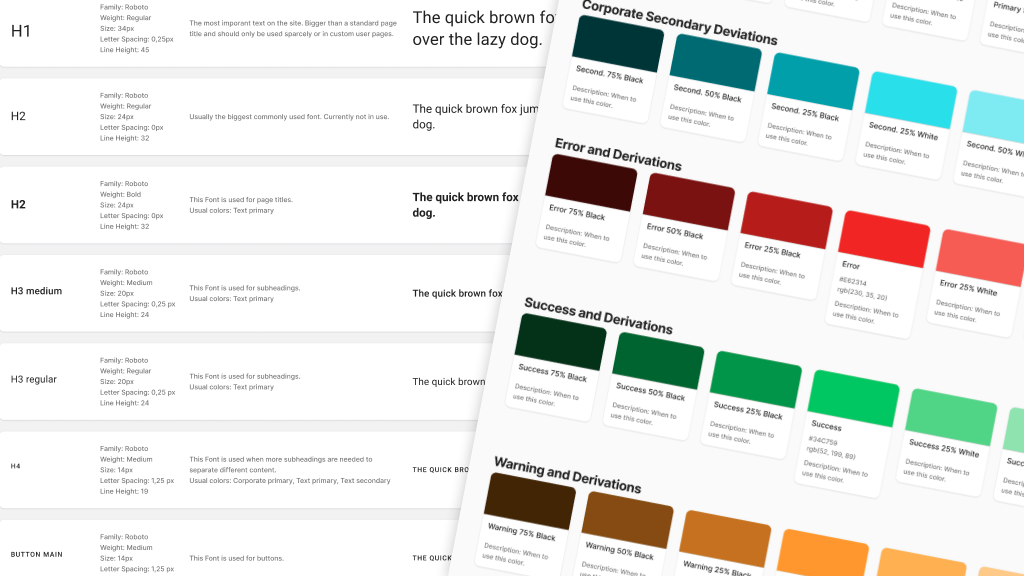
This means that we have started to collect colors, fonts, spacing, elements like buttons, text boxes and much more and manage them centered in one place. In this way, we provide a so-called single source of truth that we as designers and developers can access. At the beginning of this year, we switched to the Figma program for this purpose, in which we create new designs and document existing designs with the help of a constantly growing library. Thus, we can easily ensure a consistent app image and more quality.

To gather feedback from the team during the design process, we also organize so-called Design Critiques. In these small meetings, a design or concept is presented to a round of different employees, questions are clarified and improvements or errors are elicited. This not only allows us to improve the design, but also keeps our work transparent and involves the entire team.
To what extent have you been responsive to user needs?
The customer support staff is a valuable asset here, as they are the direct link between the users, their needs, and the design team. Her input in conceptual work and design critique meetings always gives us a good insight into what works and where users or customers might have problems. Of course, the experience gained from MEA also plays a major role, which we incorporate directly into product development.
Based on this, we created a number of so-called personas at the beginning of the project, among other things. These are fictitious characters with special characteristics and peculiarities, which we include in the conception instead of real testers. For example, an elderly lady with impaired vision depends on being able to view larger text within the app. Meanwhile, an employee who is not very tech-savvy must be able to create an article in the CMS without any problem. In this way, we can cover the needs of future users in advance.
Furthermore, we are now increasingly taking advantage of the nature of the different platforms and offer different operations that are specifically adapted to Android, Web and iOS. The apps respond to the device’sdark mode and likewise, increased attention was paid to the issue of accessibility during design and development.
With the CMS, we make sure that the interface can be easily adapted to the needs of the customers and offers assistance in as many places as possible. In this way, we want to strengthen the independence of our users.
What challenges did you face in creating and implementing the new design?
In fact, the accessibility mentioned in the previous point very often forms a challenge. Especially with regard to the readability of elements, we always have to make design compromises here. Likewise, it must always be weighed up to what extent platforms may differ; after all, it should still be possible to recognize a feature and its basic functions in the platform comparison.
In the CMS, on the other hand, the greatest challenge is and remains to prepare the enormous scope of setting options as simply and comprehensibly as possible without losing functionality.
And then there’s the point that feature development is never really finished. Be it ideas that could not yet be implemented or improvements that you want to make to the design – there are always things that you can continue to design.
But these are all issues that are part of the daily work. So far, we as a team have always managed to master every challenge with aplomb, and I am confident that this will continue to be the case.